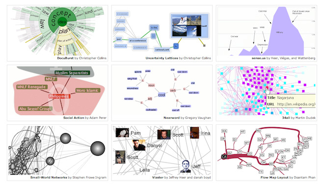
What are the best representations of information that you’ve ever seen? For most people, they’re the ones that are the simplest to understand. The ones that display information clearly and move people to action. Or inaction:
Even in a different language, if we understand the context, the message is still clear.
That’s what good data visualization does. It takes information and lays it out in the simplest of terms to get across what needs to be communicated.
KISS
There’s no getting around the fact that data analytics is intimidating for most of us, and that it produces a lot of really interesting factoids that can move people to action. But when you’re trying to get across complex information, there are still ways to keep messaging simple. In fact, the more complex the information, the more imperative it is to KISS (Keep It Simple, Stupid). Or, in the words of Joey Cherdarchuk, director of operations at DarkHorse Analytics, Data Looks Better Naked.
THE MASTER AT WORK
If you haven’t seen Hans Rosling’s fascinating TED Talks using his free software GapMinder or watched his fascinating holographic data visualization on YouTube, you really should take the time to be impressed. And inspired.
Even if you’re not a data analytics person, watching Dr. Rosling will help you think about presenting information better, whether you’re a frontline fundraiser, researcher, social media guru, consultant or …just about anyone. Okay, go watch those two videos and then come back and we’ll talk more about available resources for visualizing data.
RESOURCES
Now that you’re inspired to do something different, let’s talk about what’s available for manipulating and showing off the great conclusions (or continuing questions) that your data is begging you to share.
Enter the graph, the moving chart, the GIF, the mini movie, the podcast, and the interactive illustration, to name a few, all made possible by recent entries into the market from companies including (in alpha order) Advizor Solutions, a flexible visualization tool that is especially good for looking at annual giving results and gift officer portfolio performance; Factary, whose product Atom allows you to visualize relationships between people, organizations and entities; Rapid Insight, a modeling and illustration package; and Tableau Software, an interactive visualization tool that allows for on-the-fly graphic shifting and drill-down-into-the-data capability.
What’s free?
NodeXL, which adheres to Excel like an elbow-length glove to allow you to manipulate and visualize relationships and social media interactions. Hans Rosling’s Big Data manipulator, GapMinder, which he uses in the aforementioned videos, is also completely free to download. And there are lots of others.
Where are some examples of visualizations?
Here is a terrific collection of resources from Andy Kirk, a UK-based freelance data visualization design consultant. And Mike Bostock of The New York Times has pulled together a great compilation of compelling visualization tools.
Finally, we’d like to leave you with a quote by David Schmitt, head of Performance Strategy and Planning Analytics in the finance division at the Intercontinental Hotels Group (IHG). Schmitt’s team is responsible for communicating information about IHG’s financial performance in a way that is entertaining, compelling and clear. You wouldn’t think that corporate financials would lend themselves to music videos, but that’s one of the tools Schmitt’s group has used to visualized data. For him, “data isn’t the point; numbers aren’t the point—it’s about the idea.”
It looks like our Excel pie chart days are probably over, thank goodness. We’d love to hear about any tools, resources or sites that you’ve found to help you visualize data, too! Please share them here in Comments, so that all of us can check them out.


