At the most recent NEDRA conference, Meghan Hakanson and Amy Begg of Harvard University delivered a session to a packed room on how they created pivot tables to sort through mountains of data to identify reunion prospects. What had session participants clamoring for more was the nitty-gritty details of how Meghan and Amy actually did it. So I asked them to share their project with us – step by step – so that we can all try it, too!
Huge thanks to both of them for their generous willingness to share, and to Meghan especially for writing this article.
Have you ever found yourself sorting through mountains of prospects and thought, “There must be a better way to do this!” and at the same time, “but I don’t have a lot of time!”? We found ourselves saying and thinking the same things to each other as we embarked on a new project for our Reunion and Annual Campaigns team here at Harvard.
This group of roughly 25 fundraisers shepherd all of the College’s reunions each year. They are in charge of spearheading events, coordinating volunteers, soliciting donors in each and every class, and engaging with each member of each class. This monumental task challenges each fundraiser because they are assigned to 1,500 to 1,700 people per class. Needless to say, it was difficult for fundraisers to sort through who had wealth.
We decided to help them sift through the haystack and find the shiny needles. How? Two ways:
- We sorted through each class to find wealth points such as: wealthy zip code, six year giving, largest one time gift, rating amount, gift of securities, on behalf of giving, and prestigious job title. We then highlighted these names and provided them in an excel spreadsheet.
- We created pivot tables that provided ballpark ask amounts. We pulled the past five years to go through the 5th, 10th, 15th reunions and looked at their most recent gift. We then filtered the list by job title and company.
Below is an in-depth look on how we created these pivot tables.
GETTING STARTED – Pulling and standardizing data
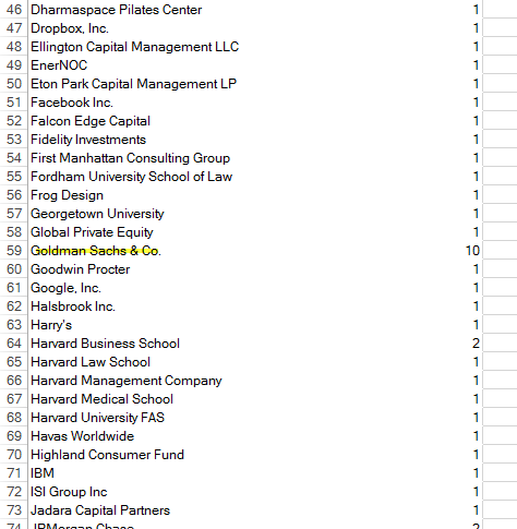
First, we pulled all of the class data from our database. Once we did that we had to clean or standardize the data. In our database we found that many people spell company names differently. If someone works at Goldman Sachs, for example, we might see it in the system as simply “Goldman” or listed in all caps, “GOLDMAN SACHS.” In order for the pivot table to really work we needed to make sure that all of the company names were uniform. You can see below how we standardized the company name to Goldman Sachs & Co.:
STEP TWO – Creating the pivot table
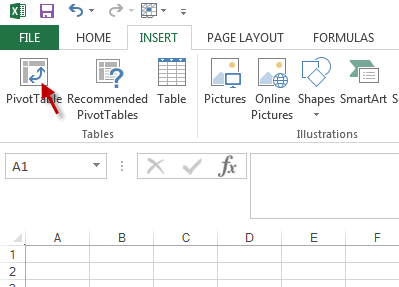
Next, we inserted a pivot table into the excel spreadsheet we were working in. We clicked into any cell in the main data section and then selected Insert->pivot table.
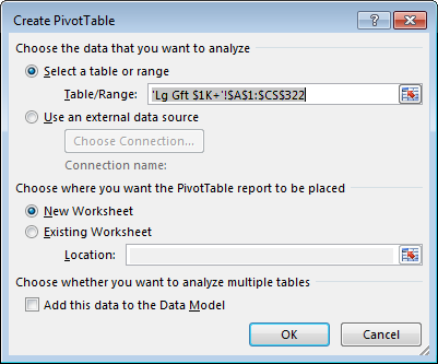
This window will appear. Click OK.
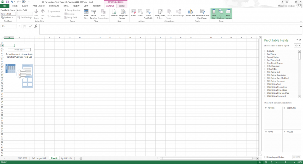
A new tab will appear and you are ready to begin!
From the pane on the upper right-hand side of the sheet, you can start dragging items to the “PivotTable Fields” boxes (see below).
STEP THREE – Rearranging and Customizing
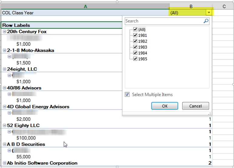
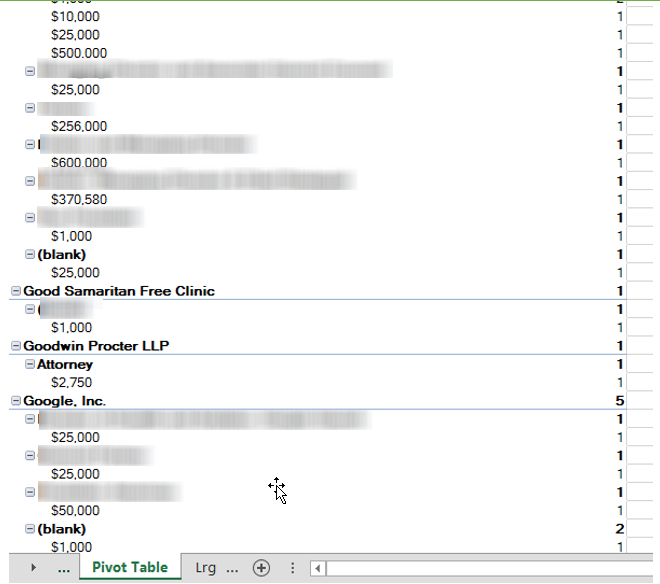
Pivot tables are incredibly forgiving and you can easily pull items from the top box and move them around to the lower box. If you decide that something doesn’t look the way you want you can easily click and drag it to a different box. Below are images of the finished product that we delivered to the fundraisers.
We received positive feedback from the fundraisers who reported that they often use this tool to help them create ballpark ask amounts.
Regardless of the volume of your prospect population, using two simple factors – wealth indicators and past giving – can help you quickly prioritize groups of prospects and create a tool everyone can use.
